
How to Choose the Right Paper for Your Project

By Uncategorized

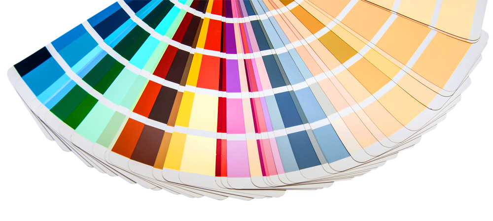
Paper quality matters. If you have ever noticed the difference that a slightly thicker-than-expected business card can make, or delighted in the slickness or texture to an invitation or flyer, then you understand the difference that the tactile sense of touch can make. Conversely, choosing a cheap or project-inappropriate paper can contrast with the message you are sharing. By choosing the appropriate paper for your project, you can make a great impression on your clients and prospects. With that in mind, you have a few choices to make regarding durability, yellowing, the ability to resist scuffing, and the sharpness quality if you are printing images. Coated vs Uncoated Paper When choosing the best paper for your project, keep in mind…

Read More

Do’s and Don’ts When Choosing Color for Your Marketing Materials

By Design, Marketing

Wisely chosen colors communicate who you are as a brand and a company. “A study from the University of Toronto…revealed most people preferred simple color combinations that relied on only 2 to 3 favorite colors” (Hauff, 2016). It is not only your logo and text that communicates in your marketing materials—color also communicates who you are as a brand. Complementary colors are opposite of each other on the color wheel, but interestingly, red and green, which are complimentary, “are a common problematic combination for people who have some color blindness… Facebook is blue because Mark Zuckerberg is red-green colorblind? He sees blues the best” (Hauff, 2016). Interestingly, blues and greens have a calming effect, while blue is more business-like and greens convey instruction and…

Read More

3 Tips to Choose the Right Font for Your Project

By Design

Here at Miklis, we want you to look good on paper, and your font choices are a critical part of getting that job done right. Oftentimes companies and organizations will create a brand kit which contains two-to-three fonts they’ll use almost exclusively for headings and text. Limiting your fonts builds consistency and increases recognition with your audience and customers. 1. Serif versus Sans-Serif Fonts Serif fonts like Times New Roman and Garamond contain little “feet” or hooks at the end of the letters. Sans-serif fonts like Arial and Comic Sans do not. Each type of font has better readability depending on the medium. For online or eBooks, sans-serif is easier to read, but for printed work, the difference between the…

Read More